
British Gas
Created the next generation energy app and released the MVP into the app store within 82 days. Removed over 200 pain points for their customers. 55% of all customers use the new app. £20 million of card payments through the app. Creating an expeirence personalised to each customer type and their products.
Role
Lead UX designer
Sector
B2C Energy app
When
2017-2019
Tools
Platform
About
British Gas has a 200 year heritage and is the biggest energy supplier in the UK and serves around 12 million customers with energy and services.

Problem
Users need to be able to submit meter reading, smart customers need to be able to analyse their energy usage and both need to be able to access british gas services.
Users struggle to understand their energy usage, submit meter readings periodically and understand the services that are available to them when they have a problem.
Users are short on time to complete these activities, often have to find meters in dark cupboards and dont always understand the numbers on the meter. And dual fuel customers are unable to submit electricity or gas readings individually.
Solution
Create an app that understands the products that ther user has and only show the relevant information that is applicable to them.
Allow users to submit their dual fuel energy meter readings individually
Include the ability to turn on the torch on their phone when using the app during meter reading entry.
Bring services into the app to allow them to subscribe to services or book one off appointments easily.
involve real users throughout the process to validate the app at every stage.
create a smart navigation that adapts to the users products.
provide in app help and show relevant information to understand the data including info graphics, charts and explinations.
Key outcomes
Delivered the MVP of the next generation app in 82 days
New features released each month (17) into the app store
Every part of the app was user tested before delivery addressing over 200 pain points
Unified the teams to create a coheisive design
Created a first energy in app payment service and cross sell purchase journey
Call volumes dropped by 4.3 million with 55% of customers using the app
Creating the next generation app in 82 days
The project
As part of a wider digital transformation project for British Gas we would be working to create a new mobile app that will allow British Gas to provide an enhanced experience for their customers using an agile process to deliver improved existing and new features now and in the future.
Working with a multiple agency and client mixed team of 40+ individuals consisting of Product owners, UX/UI designers, business analysts, developers and copywriters, working alongside the key stakeholders of the business to deliver one of the most ambitious projects within British Gas.
Challenge
Focusing on their next generation app, I worked on three main phases of the project delivering multiple features tailored to the target customer types following the CX vision and experience map, whilst also setting the foundations for the future, to provide British Gas with a structure that would allow them to expand and reach their whole customer base further down the line.
Phase 1. Create a new app for smart energy customers and get to launch within three months.
Phase 2. Expand the app to include the wider energy customer base.
Phase 3. Open the app out to service based customers and reach parity with the older existing app.
We followed the Google sprint design process for each feature that went into the app. New features were released every month after phase 1 and all features were tested by real customers in the onsite lab prior to releasing into the app stores.
Understanding
Give the team understanding in the types of users that will be using the app and which users will be included within each phase of the product.
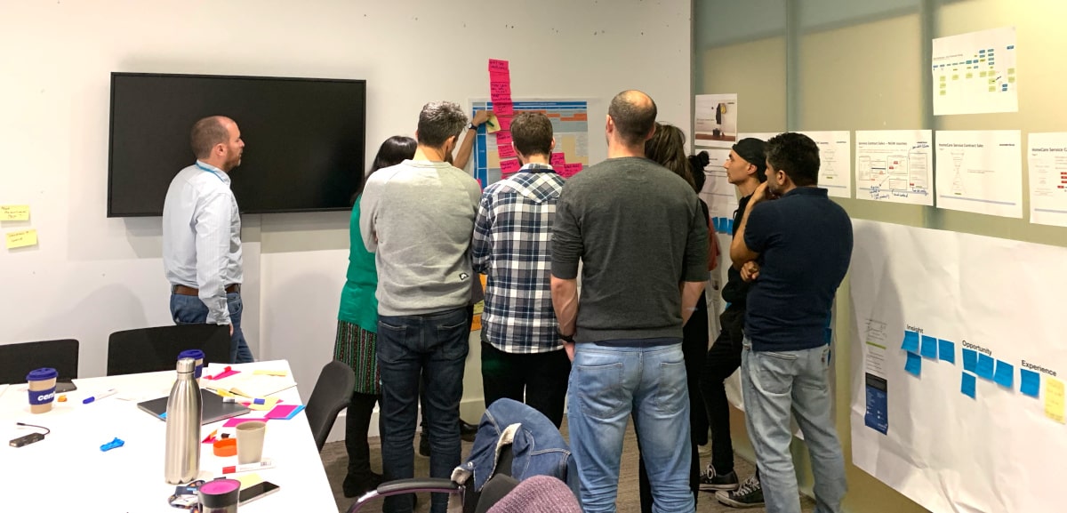
Using the google design sprint process include all members of the team and experts in each area to gain a full understanding of the problem, including the business, analytics, call centres and real users.
Provide a constant frame of reference using the experience map to provide full visability to the teams and business
Research
Analysis
Anlyse competitors and the previous app to gain understanding of features and issues. the data analytics would give insights into most commonly used features and frequency for the different user types.
This could then be used to understand the users behaviours, helping to prioritise what the users actually use and guide decisions for the new app.
User insights
Research into what the users were using the app for, when they were using the app, for how long and why. Combining the research with the user actions within user testing of hypothesis to provide a full understanding of the users behaviours wants and needs.
This was then used to open up new opportunities, reduce bias in design decisions and create an intuitive product for the users.
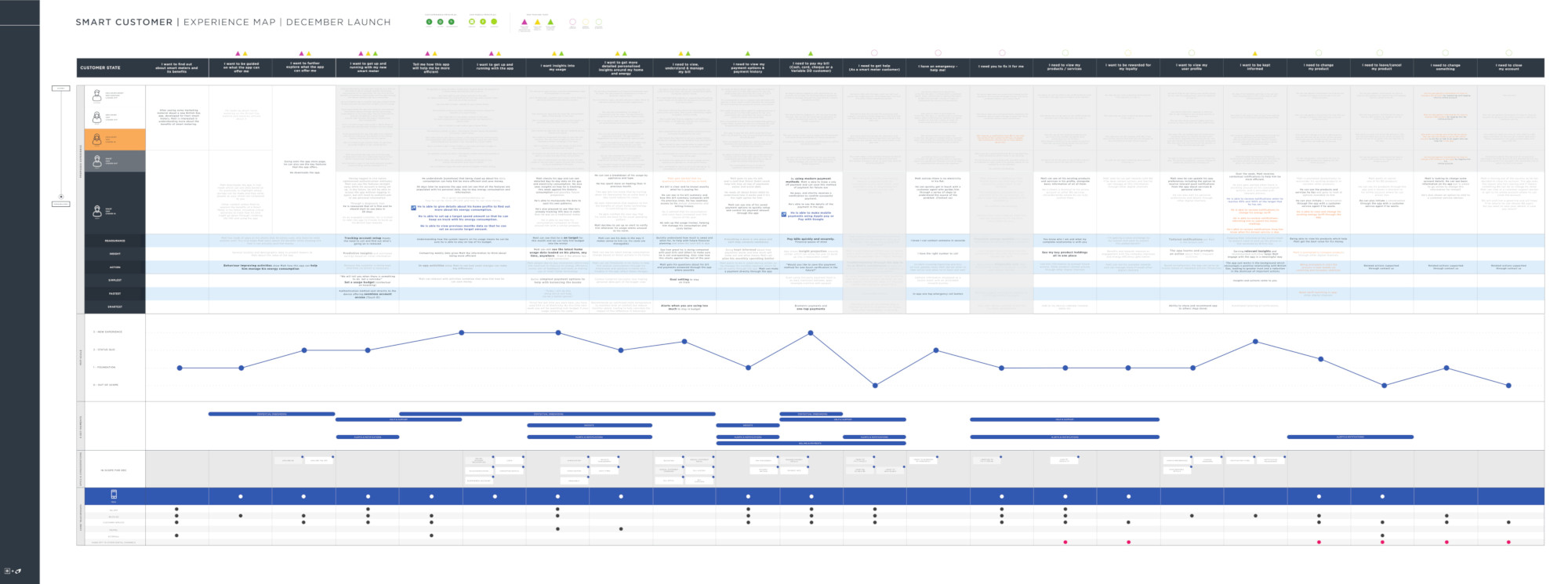
Experience map
Updated the experience map to show how the new features were inline with the experience that we were trying to create for the customer and align with the business needs.
This was also used to understand the key moments that were needed in order to deliver an MVP that met the core needs of the customer type we were building for and delivered new functionality that was not available on the previous app.
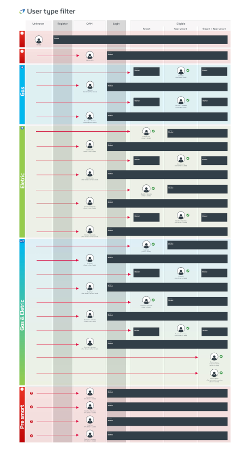
User types
I created a map of user types so that we could easily communicate between the teams who would or wouldn’t be given access into the app, and what features they would be able to use.
With each user type that was included, new challenges emerged that needed to be overcome, changes in access into the app, products that would be available and combined functionality to name a few.
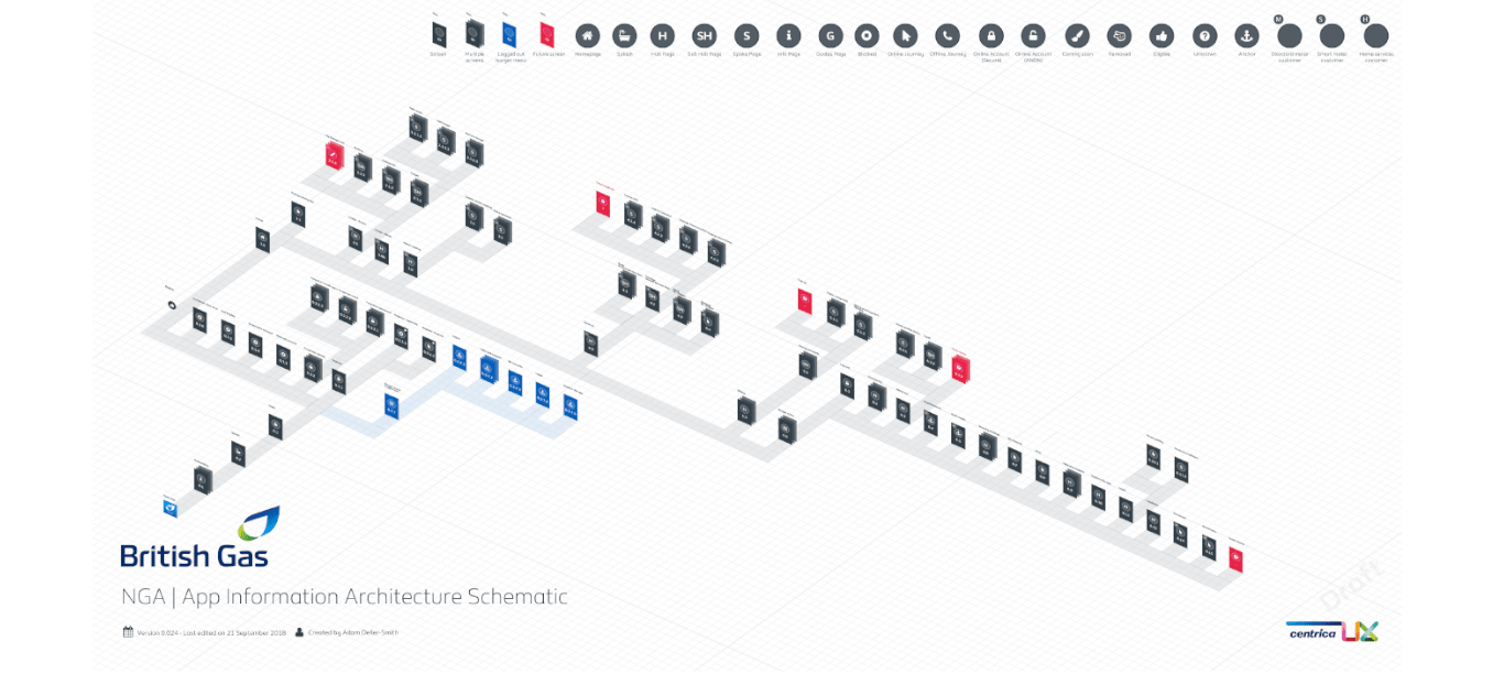
App IA
By creating a full isometric information architecture of the app, this would allow us to communicate the areas of the app that had been created, those that were being worked on and areas for future development.
Teams would be able to understand how new journeys would be integrated into the existing framework, and progress of the app could be presented to the wider teams to improve understanding and keep everyone updated.
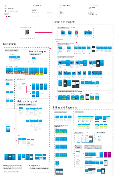
Blueprint
I created a blueprint of the app in its current state at each stage, so that all of the teams could see a complete overview of the app. This became a useful tool in unifying the design as well as communicating the progress of the app to the wider team and stakeholders.
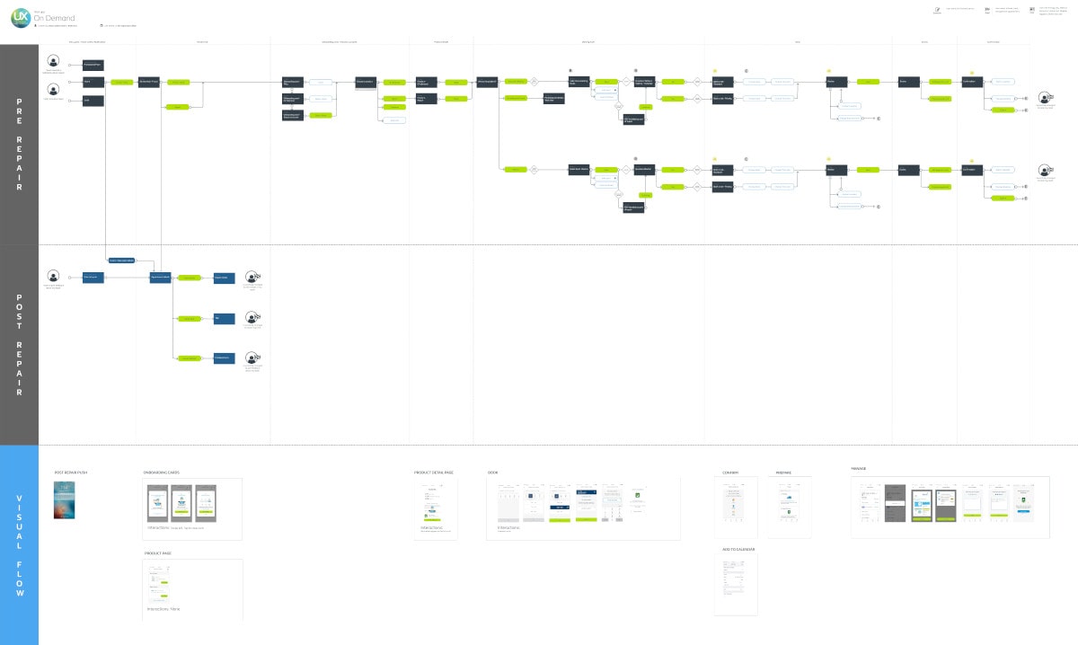
Journey map
To make the handover experience easier with the developers, project team and the wider business we created an improved journey map that allowed the user journey to correlate with the screens in a single document, channels were used to represent the different aspects that were being built, from the main journey, sub journeys and error messages in an easy to understand format.
Unifying design
I carried out an initial assessment of the app highlighted some fundamental differences in design between the three teams that needed to be addressed prior to launch. We ran a weekly design catch up to focus on different aspects of the design toolkit to bring everyone together and implement the changes across all teams.
This helped us to deliver a coherent app that not only looked great but pushed the boundaries, aligned the teams and surpassed the expectations of the customers and stakeholders.
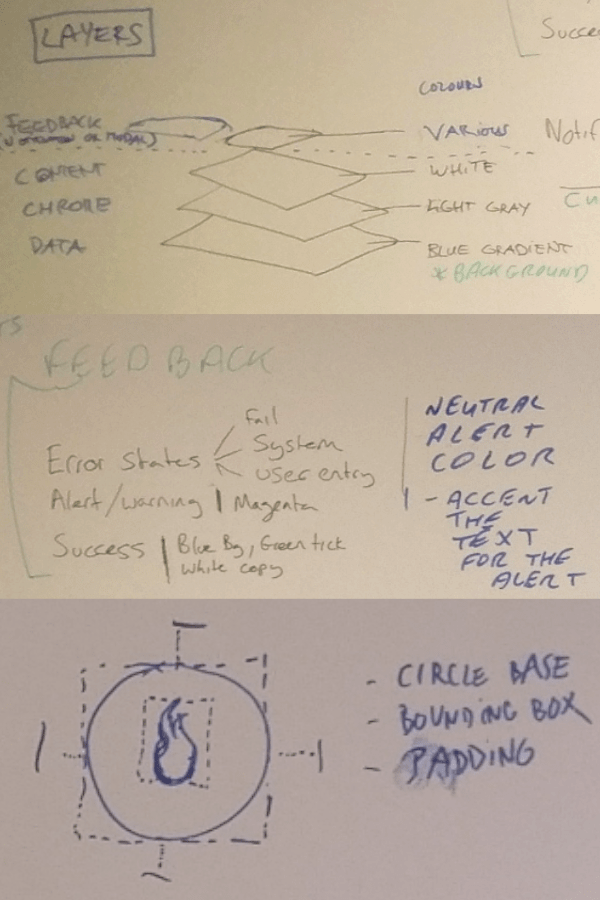
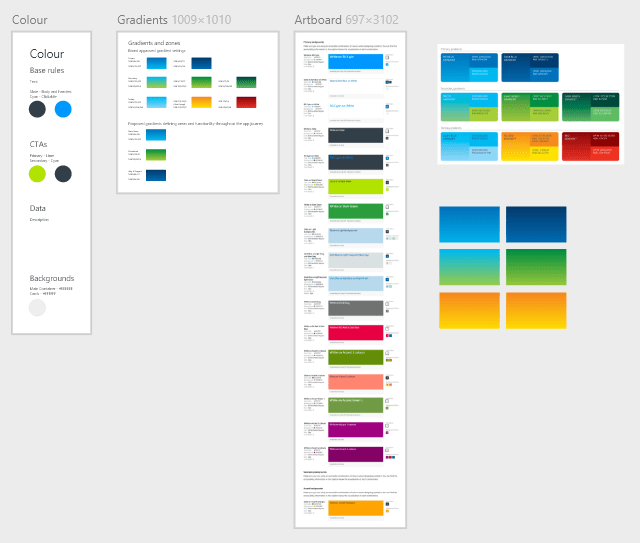
Guidelines
As we made design decisions to unify the app, the outcome would be documented into a style guide that defined the use of atoms, modules and components within the app.
This allowed us to maintain a consistent design and in turn helped to reduce development time that could be used to push the app further and finesse other aspects of the app such as animations, interactions and transitions.
Problem solving
When technical difficulties occurred it was imperative to work with the team quickly to understand the issues that they were facing and look into how these problems could be overcome, both in the short term and be able to provide a way forward so that the intended experience could be implemented further down the line.
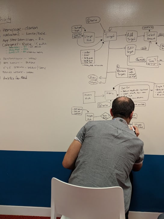
Design process
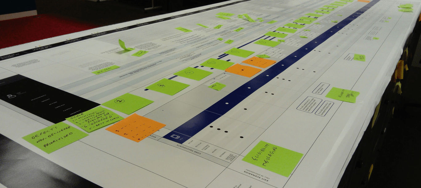
With each new feature that we included into the app, we followed the Google design sprint process and delivered the feature using Agile. We carried out workshops over several days some feature requiring more time than others depending on the complexity of the problems that we were trying to resolve.
Workshops
Workshops were used to understand and frame the problem, gathering information from around the business, customer experience team, call centres, customers, analytics, web journeys, pre-existing journeys from the old app and competitors. From this we refined and explored concepts that would later be used to test the product with customers.
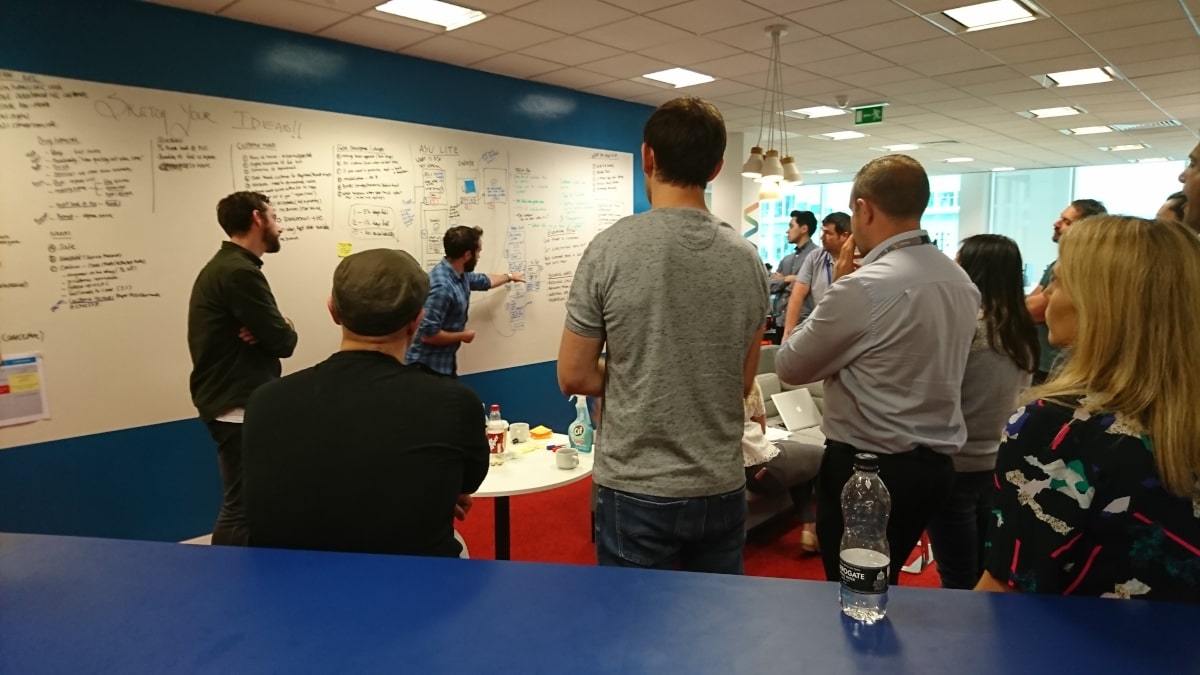
Ideation
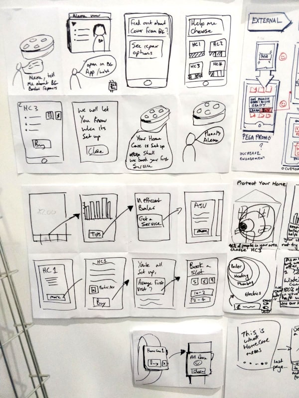
Crazy 8’s were used as a way of levitating the ideas from everyone in the workshop allowing all participants to have a voice and explain their proposal, each person would then present their sketches and once the last person had presented everyone would be given the opportunity to vote for their favourite proposition.
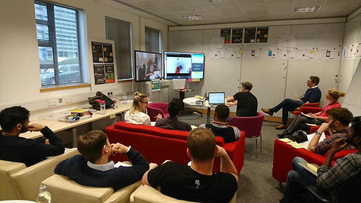
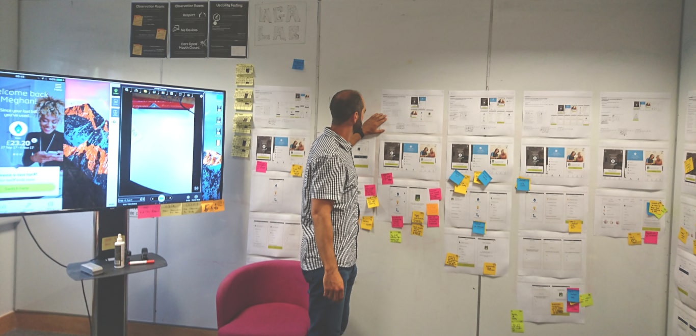
Testing
The ideas were then developed further into initial concepts and then converted into a working prototype to take into the on site lab for testing.
All findings from the tests were then used to refine the concepts into something more solid, once we were happy with the results a final version was then created as a high fidelity prototype that would be as close as possible to the final app experience.
Outcome
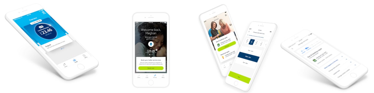
Launched the app into the Apple and Android store on time with the agreed MVP feature set for smart energy customers.
Brought the teams together to create a unified app that allowed the designers to implement new components that could be shared amongst the teams via a single guideline.
Created the first ever in app purchase journey for services, opening new opportunities for British gas and gave the ability to cross sell to their energy customers via the app. This resulted in sales from day one of feature launch without promotion.
Expanded the app to reach more customer types while releasing multiple features every month.