
GfK (Growth from Knowledge)
Delivered a minimum viable product (MVP) within a three-month timeframe, leading a team of designers and collaborating closely with business stakeholders and end users to shape product requirements. Implemented and managed international remote user testing to inform design and development decisions.
Role
Lead UX designer
Sector
B2B - Market research
When
2019 - 2020
Tools
Platform
About
GfK (Growth from Knowledge) is a global market research and consumer intelligence firm headquartered in Germany, specialising in consumer behaviour, product trends, and market dynamics to help businesses make faster, more informed decisions and stay ahead of the market.

Problem
Low user engagement due to an unresponsive, desktop only experience.
Users struggled to quickly find and retrieve the information they needed.
Unclear navigation and interaction patterns, making required actions confusing.
Poor information architecture and design structure, reducing usability.
Limited ability to access and share vital content during meetings.
Solution
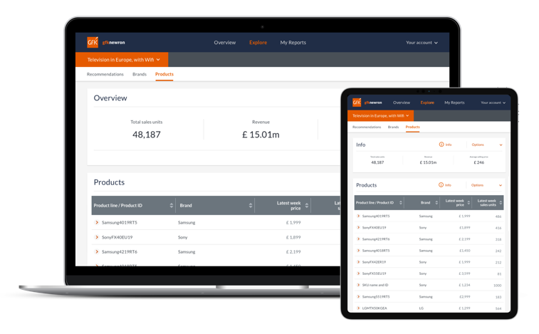
Design and deliver a fully responsive, cross platform web experience to improve accessibility and engagement across desktop and devices.
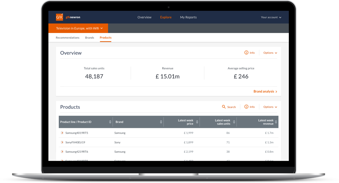
Implement a new information architecture structured to prioritise key user tasks, enabling faster discovery and retrieval of critical information.
Introduce clear, intuitive navigation and interaction patterns, making user actions immediately apparent.
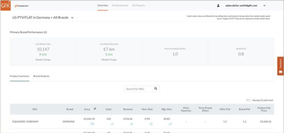
Implement robust filtering, search, and contextual data segmentation to help users quickly surface relevant insights.
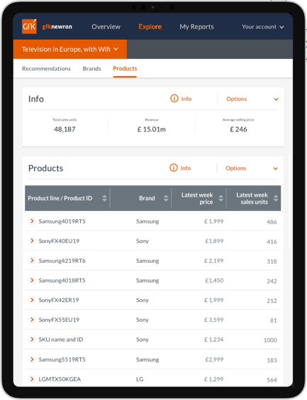
Enhance data visualisation to present complex information in a clear, easy to understand format.
Enable seamless sharing of content across platforms, supporting efficient collaboration and use in meetings.
Before
After
Key outcomes
Delivered a minimum viable product (MVP) within a three month timeframe.
Increased user engagement and usefulness driven by a responsive, cross platform experience.
Greater user confidence and understanding when interpreting data, supported by clearer visualisation and contextual segmentation.
Reduced time to find and access critical information through improved information architecture and navigation.
Conducted user testing with international participants to gather actionable insights.
Established a scalable, future ready product capable of accommodating new user cases and features.
Improving the product and process
Challenge
Tight delivery timeline: Deliver a fully functional MVP within three months.
Future scalability: Lay the groundwork for Phase 2, enabling extended features and enhancements.
Distributed team coordination: Manage and coordinate agile sprint teams across multiple countries.
Global user research: Conduct international user testing with participants from diverse regions.
Knowledge management: Consolidate all documentation into a unified system to ensure accessible and consistent knowledge.
Process improvement: Introduce new ways of working to enhance product quality and delivery efficiency.
Research
Conduct user interviews
I worked with the business to compile a list of users that could be contacted and shared this information with the design team to activly include users in the design process.
Conducted interviews with real users to better understand how they used the product, their needs, and which features they relied on or felt were missing.
Interview insights were summarised, anonymised, and stored in a central repository, then shared across the team to improve understanding and inform product decisions.
Review the existing product
Tested the original product with real users to gain insight into their needs, goals, and pain points. These findings informed the creation of a more intuitive product that empowers users to quickly find the information they need.
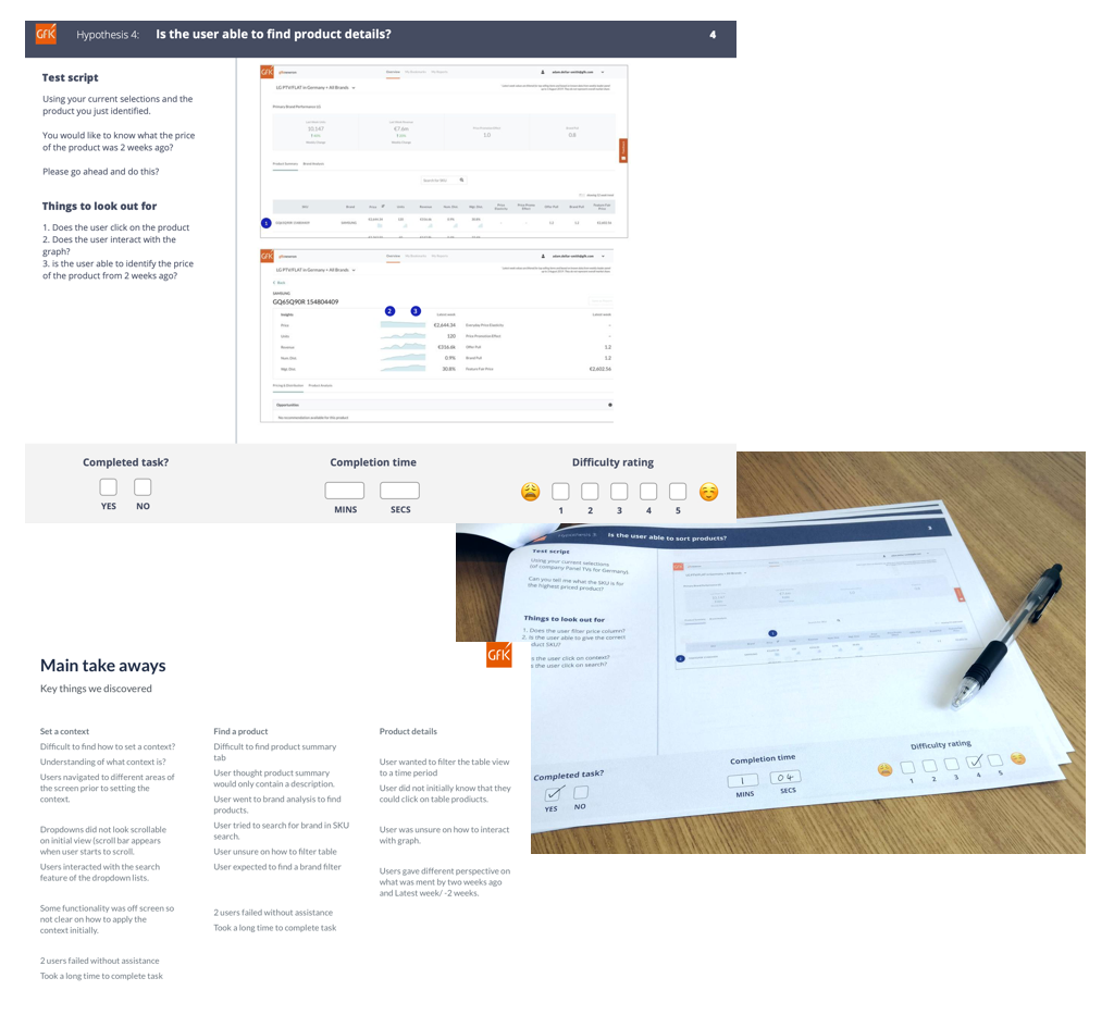
User testing
Created a template for all user testing that would allow the team to conduct user testing efficiently with instructions on how to use.
Introduced test scripts to remove bias within the test, along with pointers to help the team understand some of the things they should be looking out for during the test and provided key markers in the test screens for the moderators and viewers.
A simplified check list at the bottom of each hypothesis being tested was used to allow for rapid entry without interupting the user testing. This information could be used in later tests to see if there were any improvements.
A concise list of key takeaways was then created from the results of the testing, which would later be used to improve the product.
All features showed huge improvements accross the board, including an initial 40% fail rate on selecting context, which changed to a 100% success rate when the same test was performed with the new designs.
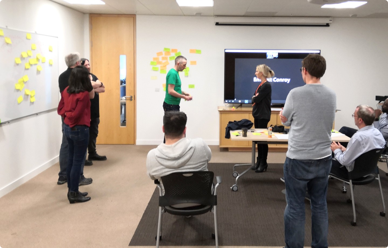
Workshops
Helping the team have a unified understanding of the project, users, features and problems to solve. working with all aspects of the project including the project team, product owners, developers, users, support teams.
Ideation and problem solving
Work through the information and place into logical groups using a card sorting exercise. placing everything up on a wall gave the team easy access to the information and replicating this within atlassian to insure availability to the whole team.

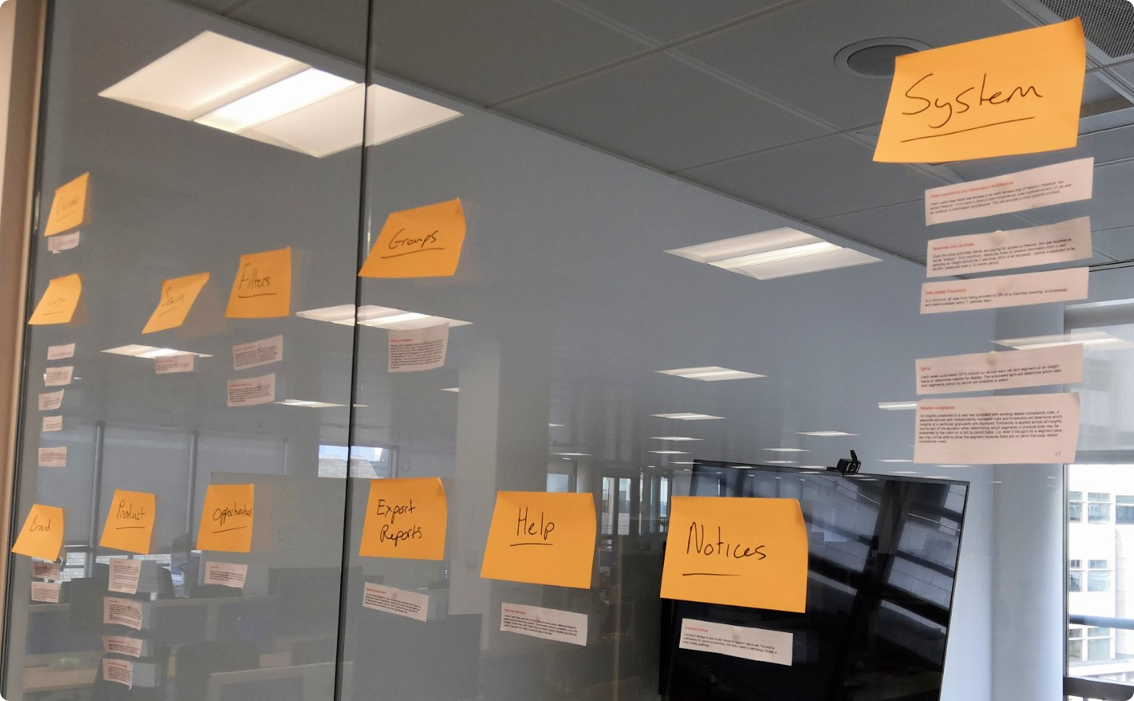
Organising features
Work through the information and place into logical groups. Placing everything up on a wall gave the team easy access to the information and replicating this within atlassian to insure availability to the whole team.
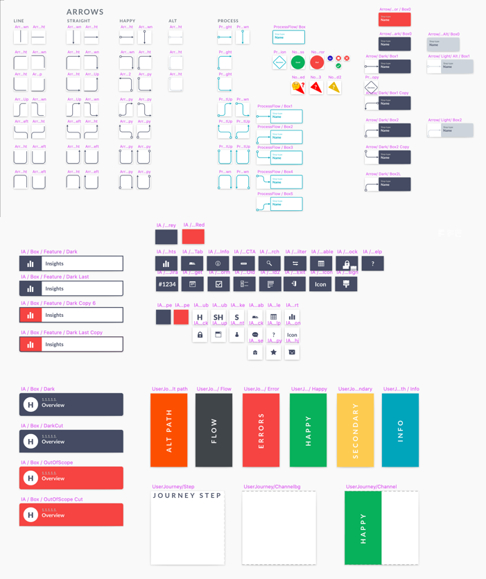
Fixed assets
I created a library of fixed assests to speed up design and keep screens consistant. Example shown is for the creation of user journeys to keep documentation within the international design team consistant and improve understanding.
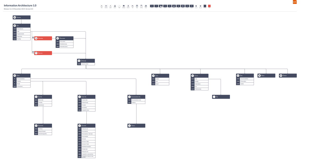
Information architecture
I created an Information Arcitecture with direct referencing into the user stories. This allowed for easier understanding of the features to be built, giving a clear indication of Hubs, sub hubs,spokes as well as identifying and tracking the scope. Used throughout the project to help track completion.
Prototypes
Prototypes were created to test the new design and user journeys. the interface was improved to highlight the key information, improved navigation and create a clearer layout for the user regardless of how they accessed the information. Info graphics were used to help communicate trends at a glance and provide a valuable way to track products for the user.
Outcome
Improvements in usability, visual representation of data, users able to access information quicker. understanding of interface improved, more control over the information to allow users to get what they need.
Set up IA to allow for future features to be integrated seemlessley into the new structure building off of phase 1.
Finished phase 1 within the 3 month timeframe, previous attempts were incomplete and had taken over 12 months prior to joining the project.
New UX and design tested against the older version showed an overall improvement for interactions, effort times, difficulty and completion rating.