
O2
Digital transformation to improve multiple systems including sales, point of sale, Identification and verification. Reducing multiple backend systems and unifying and improving the experience.
Role
Senior UX designer
Sector
B2C - Mobile network ecommerse
When
2020-2023
Tools
Platform
About
O2 is the largest mobile network operator in th UK with around 24 million customers, 450 retail stores and multiple venues. As of June 2021, O2 joined with Virgin Media to become Virgin Media O2 and increased its connections across broadband, TV, Landline and mobile to 46 million.

Problem
Multiple backend systems that are costly to maintain.
Difficult to use interfaces with no unity.
Software constraints impacting design.
Multiple system and team changes reducing efficiency, knowledge transfer and speed to market.
Solution
Reduce the backend systems while enhancing features.
Unifying the systems that customers and staff use to keep the experience consistant, reducing costs and improving delivery.
Improve understanding and increase simplicity and conversion.
Key outcomes
Consistant design across all platforms, unifying the experience and expected behaviours.
Over 30% reduction of backend systems.
Enhanced capabilities within the site to drive user understanding and sales.
Complex problem solving to drive incremental changes that deliver features faster.
Unifying teams to share knowledge, design patterns and understanding.
Multi channel solutions that improve the service, speed, and reduce development costs.
5 Releases, 100's of projects, 100's of user journeys, 1000's of screens
Overview
As a senior UX designer within the project team I worked on multiple projects and releases, including sales, upgrades, phone, SIM only, companion devices, compare, gallery, account, support systems, instore systems and more.
Working in sprints within an agile environment with a large volume of stakeholders, offshore development teams and requirements.
The project team included: UI designers, copy writers, project managers, stakeholders, legal, marketing, developers etc to help deliver the best possible experience within the capabilities available.
The objective was to overhaul the ecosystem, improve the experience, increase sales and reduce costs.
Challenge
Working on multiple areas of the business at the same time. ( eCom, ePos, Identity, Account etc) . Minimal customisations to a third party platform.
Restrictions of a backend system that required tasks to only be available in a certain place. E.g. upgrade has to start from a logged in account.
Team changes throughout the project from all aspects.
Covid changed the landscape of how we worked on the project.
War between Ukraine and Russia as the development team was based in both of those countries.
Understanding
Working with the business to understand the problem fully, gaining input from stakeholders, call centres, users, existing framework, analysing competitors, testing existing experience, store visits and using HERO principles to quickly evaluate features.
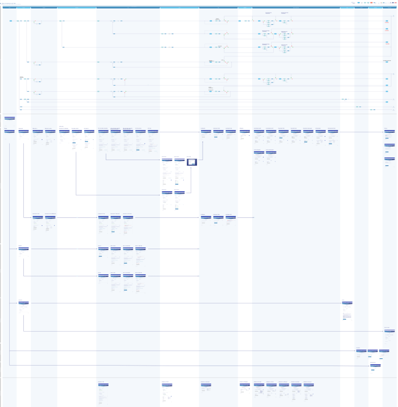
Creating documentation that can be used to communicate effectively across all areas of the project team. Making sure that the business and developers fully understand the problem, how the designs should be implemented and providing traceability back to epics and user stories.
Research
Personas
Using the five main personas identified (from over 4000 customers) as the idealist, thrifty, impulsive, concientious and assertive along with the five key customer needs: Fairness and trust, effortless, flexible, proactive and personal.
These were used alongside user testing to help keep the experience aligned with the customer and create a product that users will want.
Competitor analysis
A competitor analysis combined with a review of industry standards was conducted to evaluate existing features and identify market gaps that could be leveraged for competitive advantage.
Common features were examined alongside a heuristic evaluation to determine what worked well for users and what did not. These findings provided valuable insights that, when paired with customer feedback, helped inform opportunities to deliver a superior user experience.
Process
Starting with a clear understanding of the problem, analysing user types and development capabilities was fundamental to identifying what was not working, what was required, and what was realistically possible.
Methodologies such as Lightning Decision Jams were used to work through challenges, prioritise issues, and generate ideas through time boxed activities, enabling rapid exploration of options that could be taken forward and refined.
Design thinking and the Double Diamond framework were applied to guide the process through discovery, definition, development and delivery. This was to ensure the problem was clearly defined and an effective, user centred solution was delivered.

User stories
During my time on the project, I delivered thousands of user stories and produced even more detailed acceptance criteria to ensure the development team had a complete and accurate understanding of each user journey’s functionality. These user stories outlined the intended behaviour, capabilities, constraints, and expected outcomes, providing a clear foundation for successful implementation.
I collaborated closely with stakeholders across the business, this included product owners, legal teams, marketing, developers, end users, call centre staff, retail teams, and more. This was to ensure the solution met requirements, remained accurate, and was fully understood by everyone involved.
This resulted in reduced confusion, fewer meetings and delays, and a significant increase in feature delivery, shared understanding, and overall project momentum.
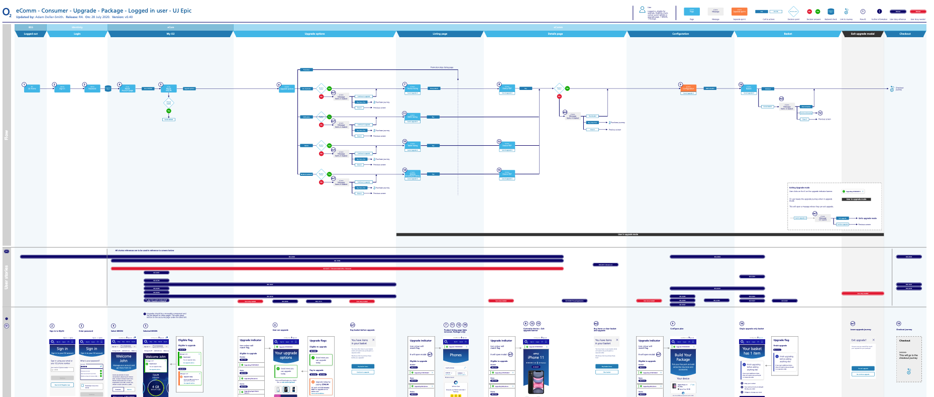
Upgrade journey
Created an upgrade journey that allows users to value their existing device and off set the cost to the new device purchase. Increasing the recycling and rejuvination of devices, while aiming to reduce costs for the customer. Complexities in backend capabilities for entry points into the journey became a challenge. New sign posting into the journey and guidance were provided to the user to make the process as simple as possible for the user.
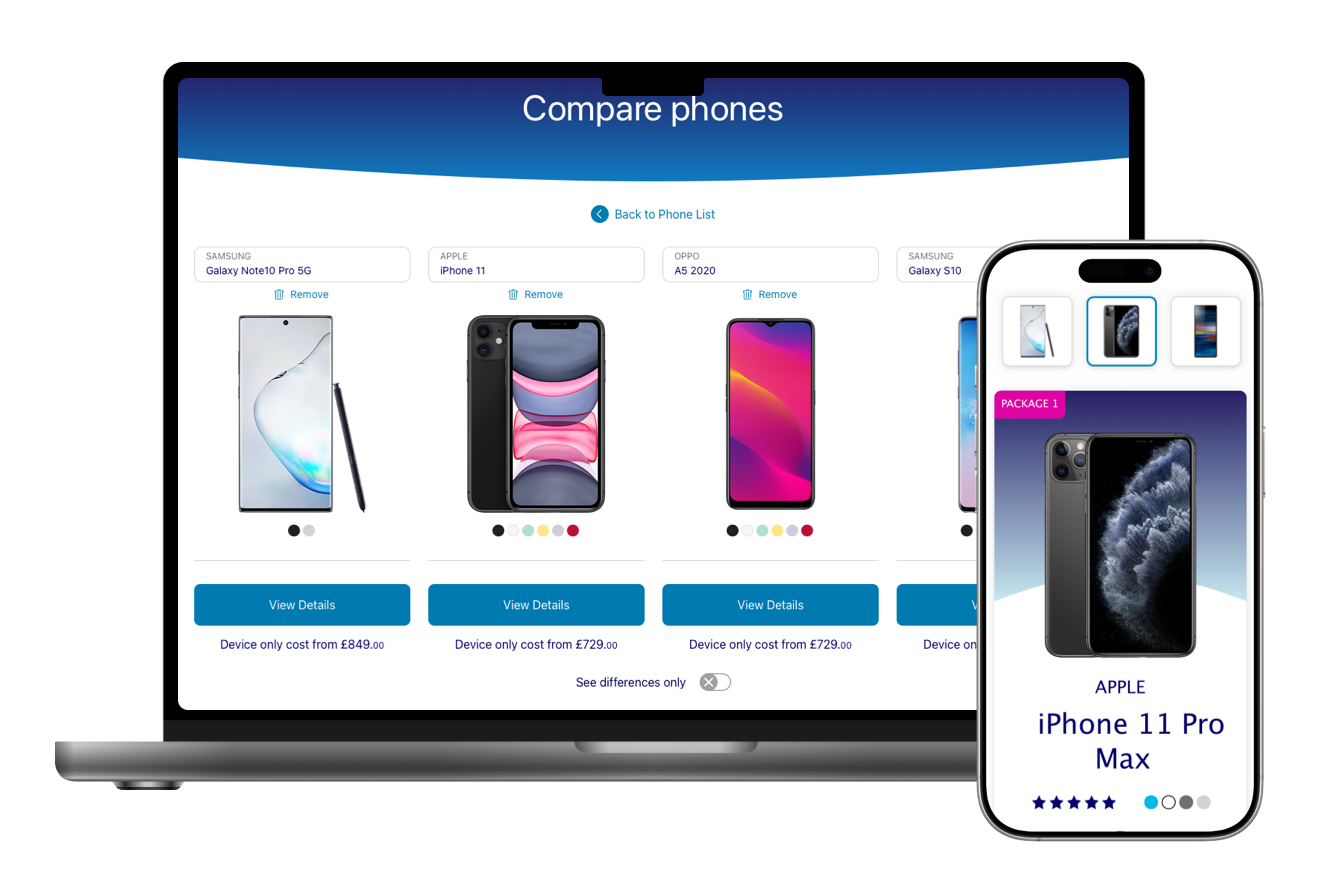
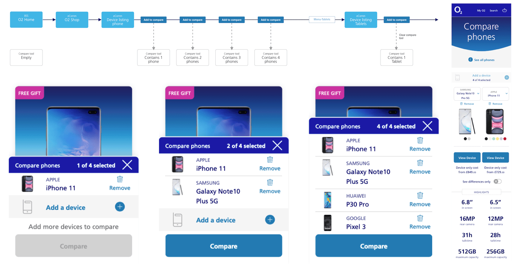
Compare products
Users can compare multiple items at once, view a snapshot of their selected products, easily add or remove options, and filter the list to show only the differences. This provides a clear, streamlined view of key differentiators without requiring them to sift through unnecessary details.
Comparison functionality was expanded beyond phones, Removing the previous limitations and introducing a scalable structure that supports comparisons across the full ecosystem.
This included all product categories, such as iPads, headphones, cases, and more.
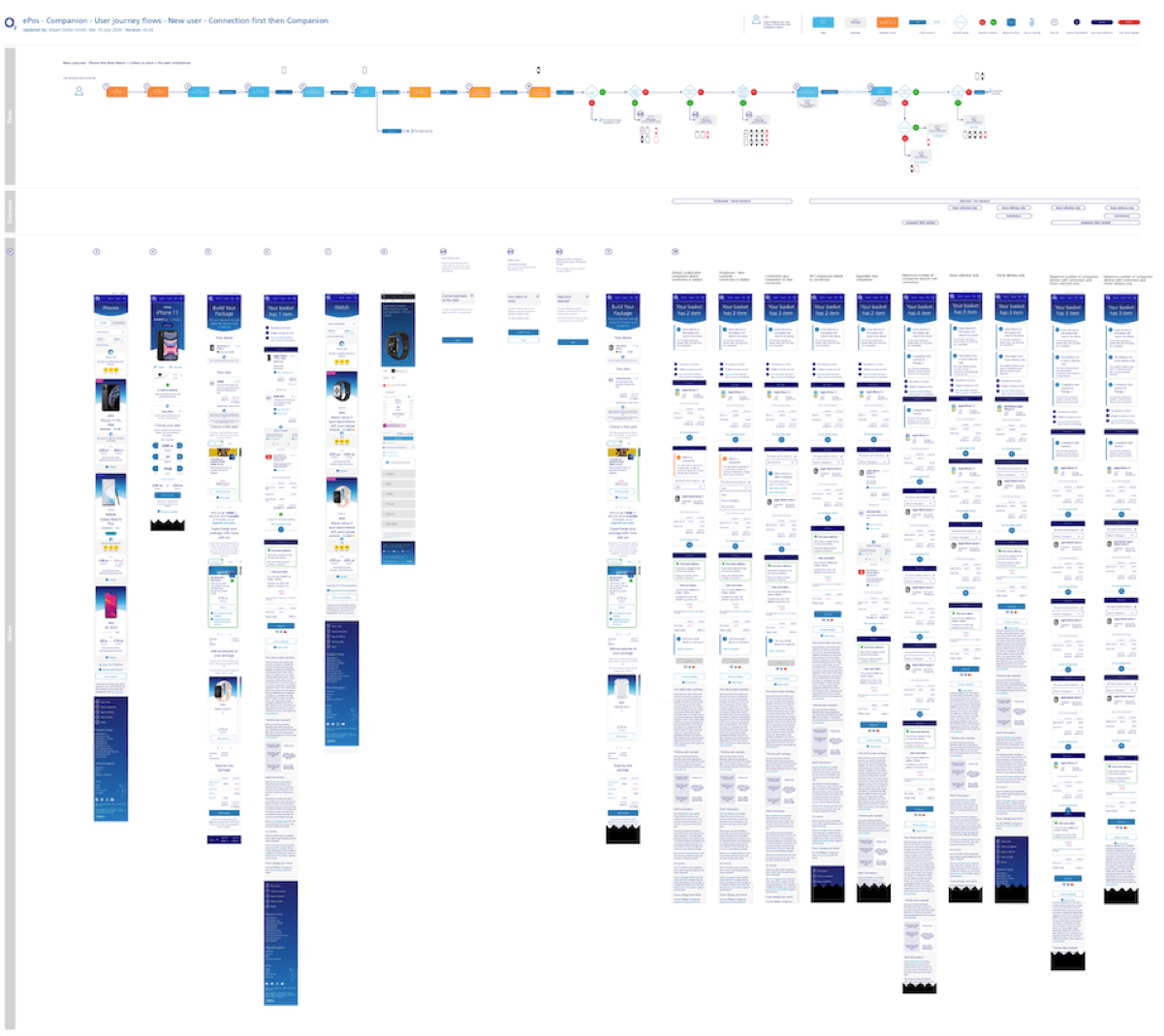
Companion devices
Companion devices refers to watches that link to phones and vice versa. This introduced multiple combinations of customer types, login states, and device pairings that needed to be supported. New and existing customers each required different messaging, tailored support, and journey variations to ensure their needs were met.
To communicate this complexity to the team, I incorporated small visual icons within the user journeys. These helped simplify the offering and provided a clear, immediate understanding at a glance. As a result, communication improved across the team, developers, and the wider business, ultimately reducing the time needed for explanations.
Enhanced gallery
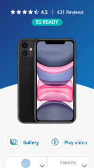
Using competitor research and through gathering data from user testing and customer input, I was able to create a product gallery that was immersive for the user and took advatage of full screen capabilities placing control in the users hands.
This also allowed the user to customise the colour of the device while maintaining the current product view. This provided a playful, immersive and engaging experience for the user and in turn helped the user to make an informed decision on their next product purchase.
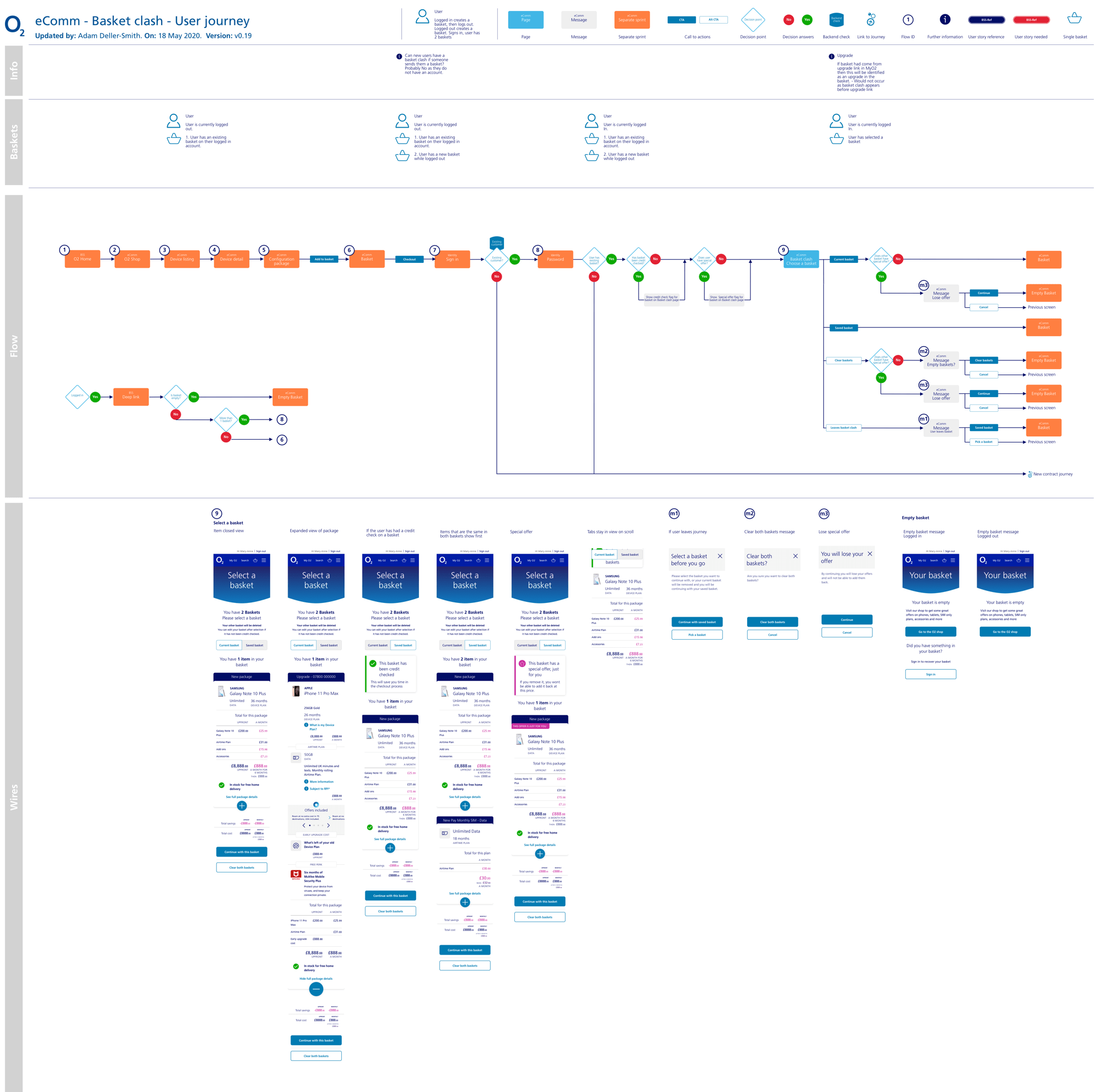
Basket clash
Basket clash occurs when a user has two active baskets, one while logged in and another while logged out. To resolve this, clear options were presented that let users review, merge, or remove items, helping them clean up duplicates or unwanted products.
Complexities such as pre-completed credit checks or applied special offers require careful handling to preserve the user’s progress.
Clarity was essential: we ensured the options were easy to understand and the wording unambiguous so users could make confident, informed decisions.
Authentication
ID and verification is the ability for a customer to be able to authenticate themselves. This is to validate who they are and provide an extra layer of security for the customer, giving them piece of mind that their information is secure.
This project brought all areas of authentication into one place, from incoming and outgoing calls, in store and franchise stores, providing consistancy in the information being required and applying the same rules across all area.
This project had huge complexities to overcome, depending on the decisions made by the user, how the interaction was made (call or in person etc) the information they have available, number of attempts, if they fail a section then alternative options would be available and the journey would adapt depending on the previous actions.
Adititional areas would be presented for agents where they would be able to take extra notes about the call or redeem a pass key to transfer the user etc.
This project provided clarity in understanding, increased completion, reduced confusion and maintenance costs and provided a cleaner consistant eperience for the customer.
Outcome
By providing tools such as product comparison, upgrade journeys linked to device recycling, simplified companion device flows, and flexible eSIM options, users were able to customise their products, tariffs, and extras, saving time and money in the process.
This approach not only improved customer satisfaction but also supported more sustainable, environmentally responsible choices.
Unifying the experience across O2’s online and in-store channels improved consistency and reduced maintenance effort, while also lowering development and update costs.
Implementing a single authentication approach across all areas of the business created a consistent set of rules and expectations, improving usability, increasing successful task completion, and reducing ongoing maintenance costs.
Finally, consolidating backend systems significantly reduced complexity, lowered maintenance overheads, and made future updates faster and easier to deliver.